Uncover the Story Your Workforce Data
is Trying to Tell.
Expert GIS Mapping & Spatial Analysis to Transform Workforce Spreadsheets into Strategy.
The Challenge
Workforce data is everywhere, but clarity is rare. Most organizations sit on mountains of provider information without a clear way to see the geographic relationships, service gaps, or emerging supply trends that define their success.
The Solution
NCAHD’s Spatial Analysis services use advanced Geographic Information Systems (GIS) to create high-impact visuals. We don’t just "make maps"—we perform deep-dive analysis to find the "why" behind the "where" of your healthcare workforce.
Turn Workforce Information into Intelligence
Mapping is more than just placing dots on a grid. It’s about understanding the spatial dynamics of your provider network.
Identify Hidden Trends
See patterns that are invisible in standard spreadsheets, such as localized provider shortages or emerging healthcare deserts.
Visualize Relationships
Understand the connection between geography, socio-economics, and healthcare workforce access.
Drive Persuasion
Use stunning visuals to tell a compelling story about workforce needs to donors, boards, and legislative bodies.
Strategic Accuracy
Move from "guessing" to "knowing" exactly where your workforce resources will have the most impact.
Our Analytical Capabilities in Action
From tracking provider distributions to correlating socio-economic factors with healthcare gaps, our spatial models deliver actionable clarity.
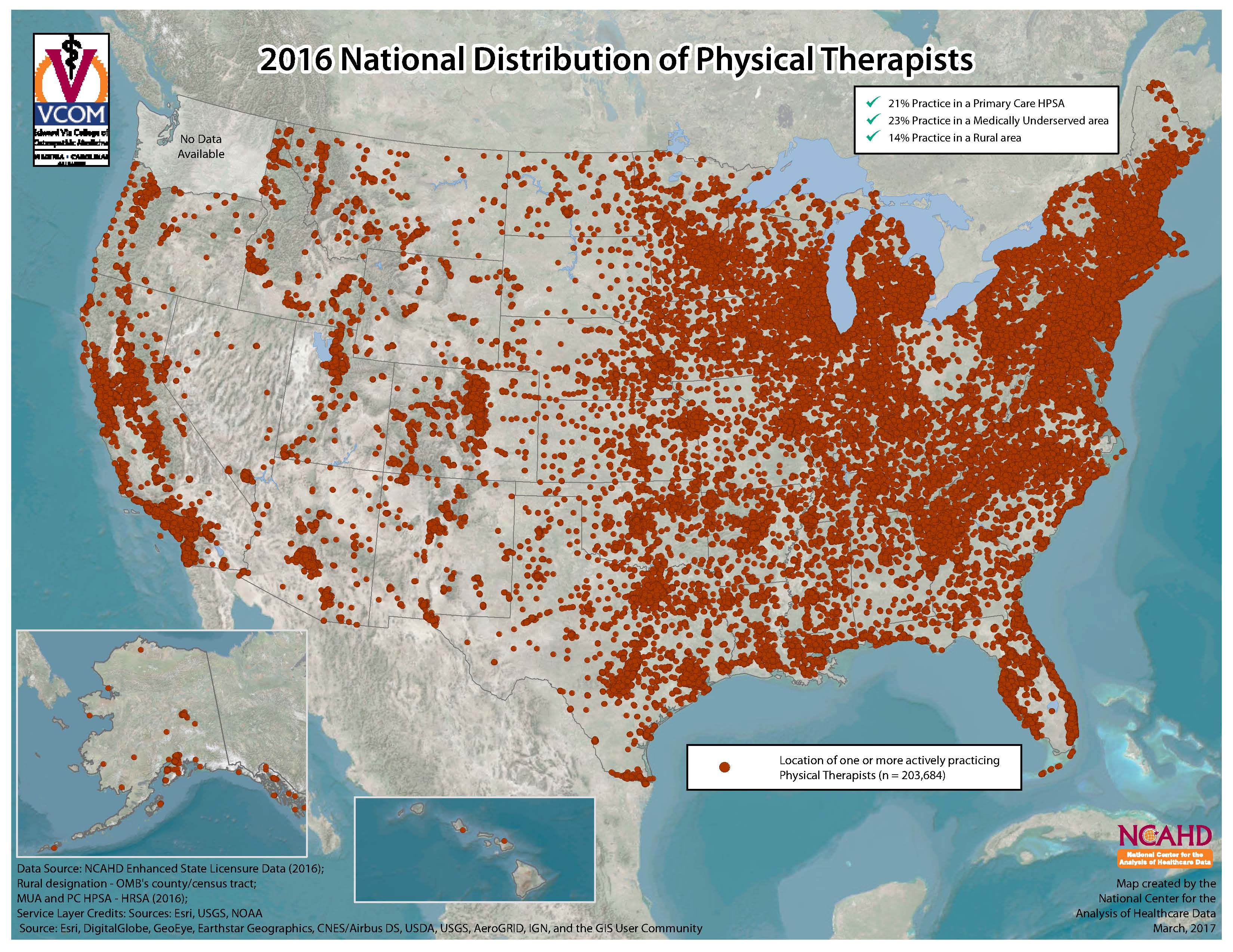
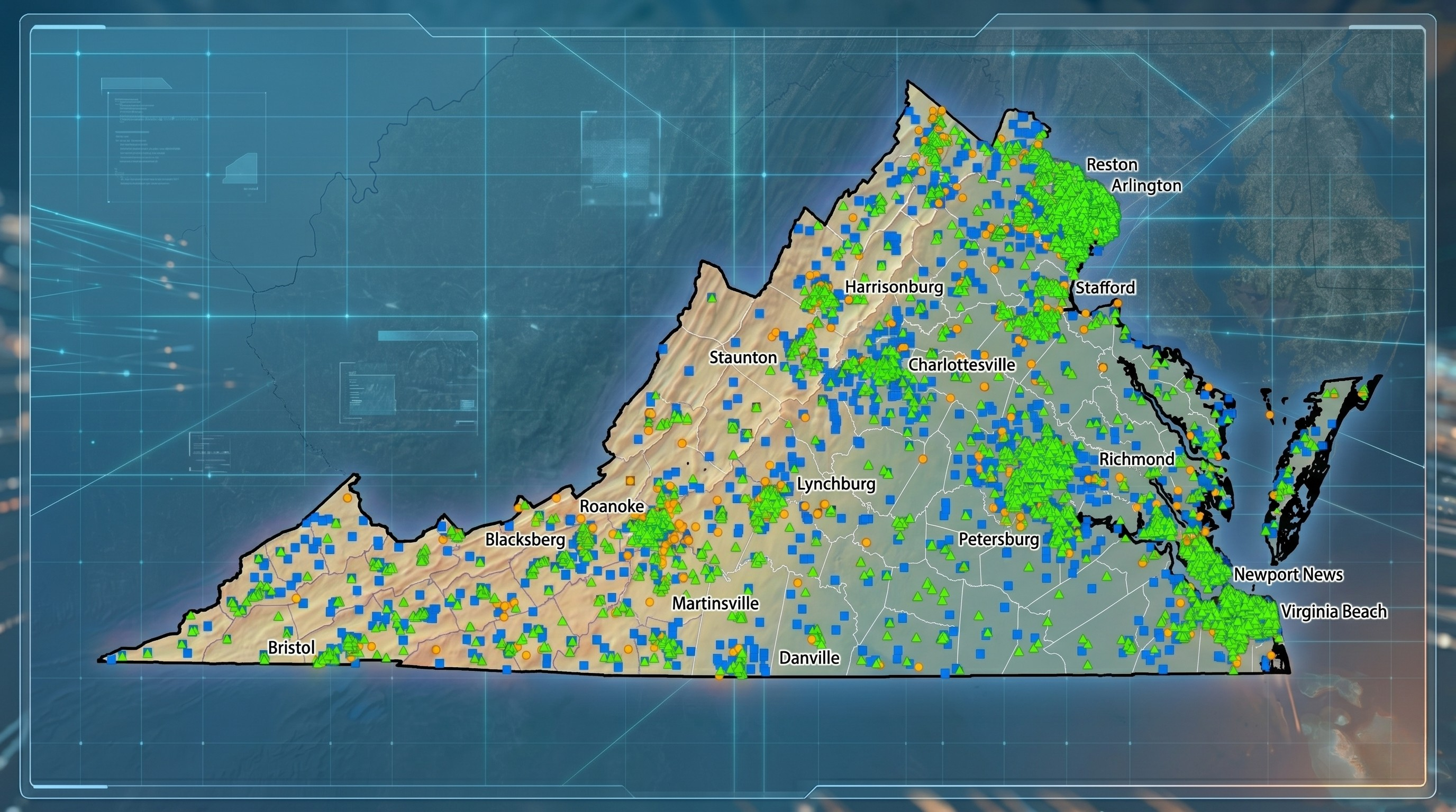
PT Distribution
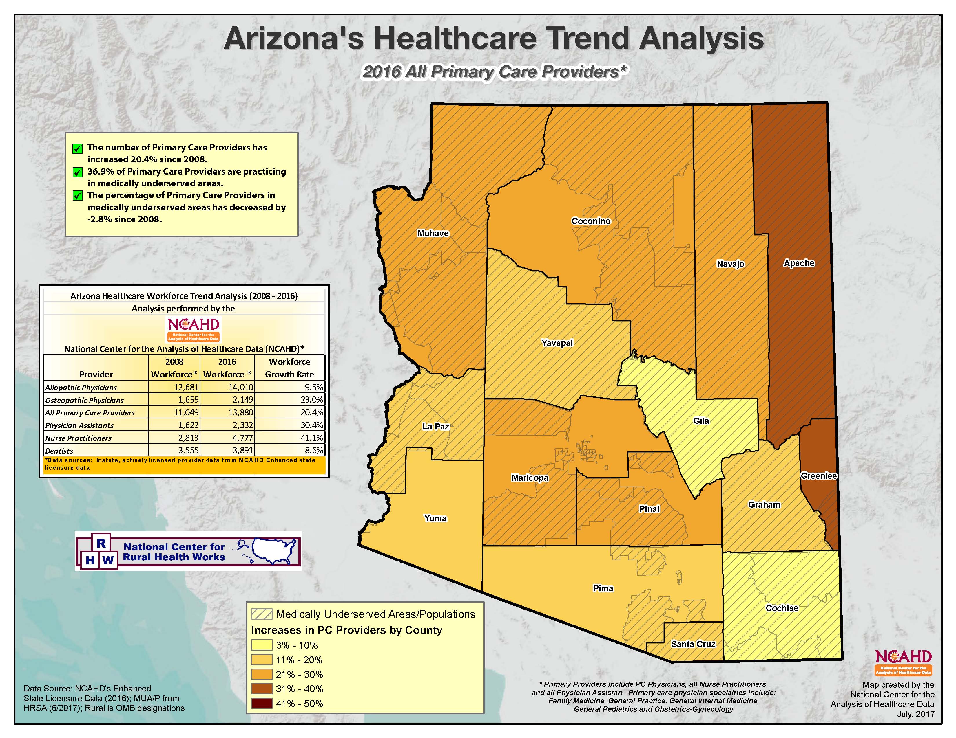
AZ Provider Trends
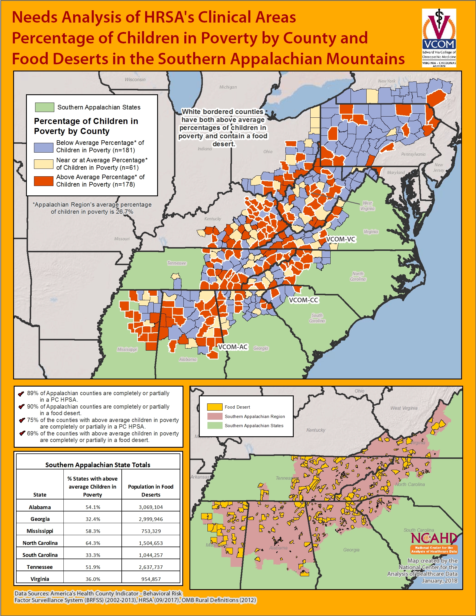
Children in Poverty & Food Deserts
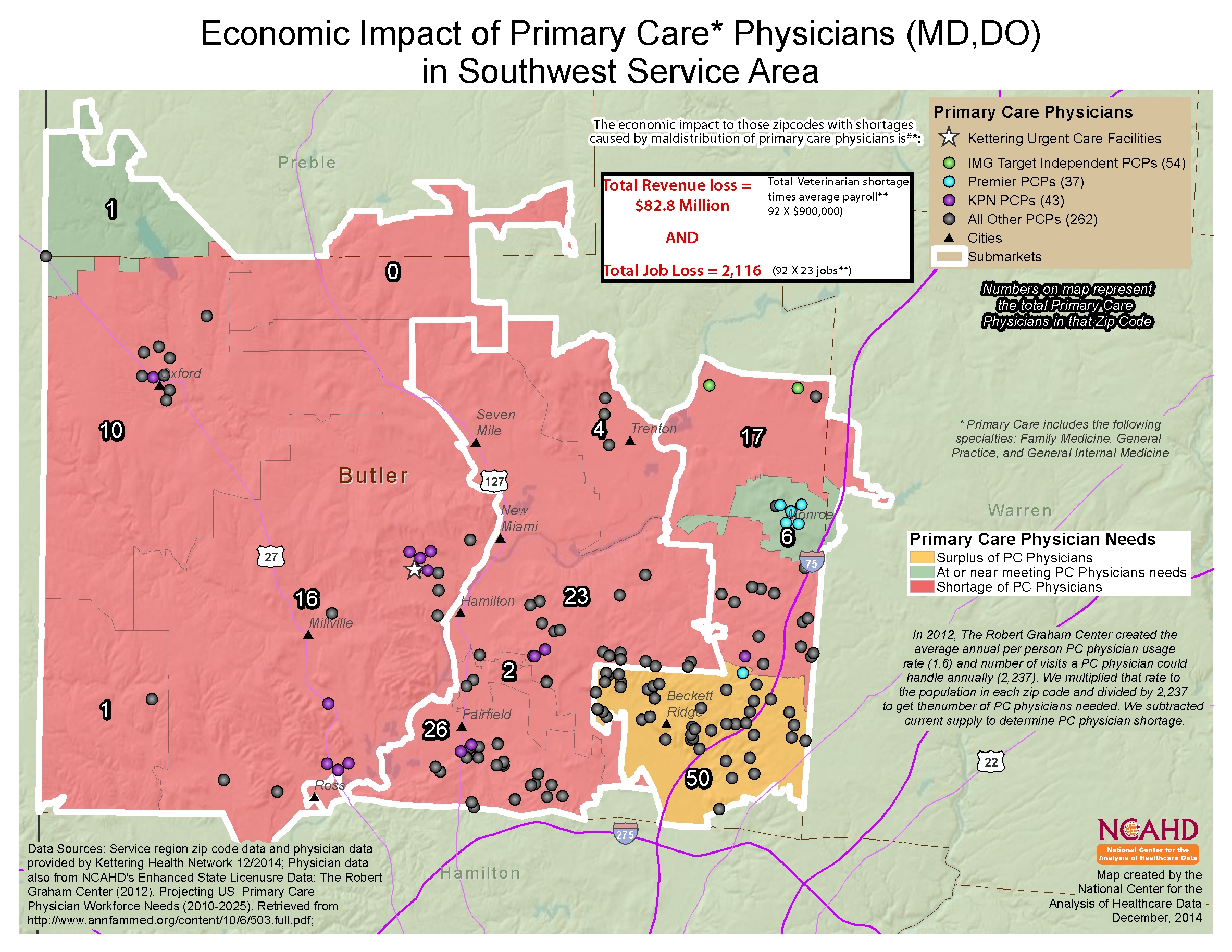
Ohio Kettering Economic Impact
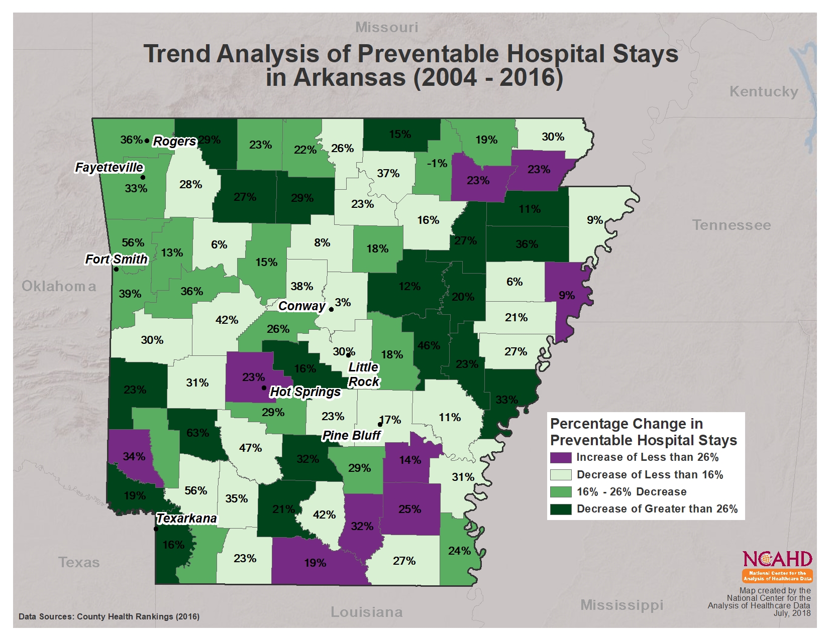
Preventable Hospital Stays Trend
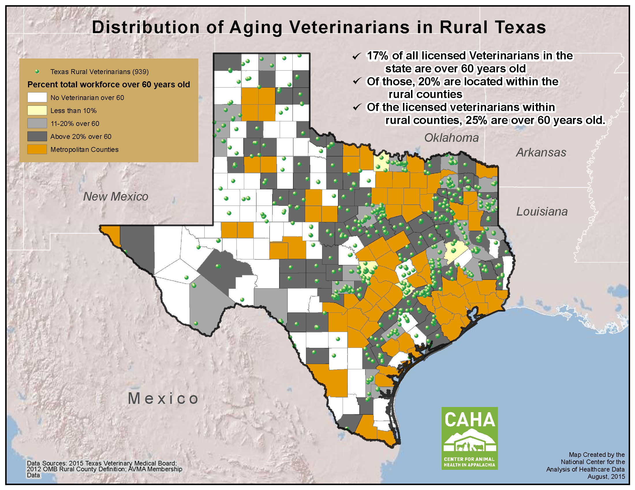
Texas Aging Vets
Built for Healthcare Workforce Decision-Makers
Our spatial analysis is specifically tailored for the complexities of the medical and public health sectors, focusing on provider distribution and community access.
Grant Writing & Funding
Provide the visual proof of workforce shortages that makes your grant applications stand out.
Outcomes Reporting
Show the geographic reach and impact of your recruitment or retention programs with before-and-after spatial modeling.
Economic Impact Studies
Map the ripple effect of healthcare providers and facilities on local and regional economies.
Board & Stakeholder Presentations
Distill complex workforce datasets into one clear, authoritative visual that drives consensus.
"Over the last 9 years, my center has been incorporating mapping and data analysis into many areas of our economic impact models and health feasibility studies. It adds significant value to our message for those that utilize our models. I appreciate NCAHD’s unique perspective in our research."
Get Started: Simple, Professional, & Fast
High-level GIS expertise shouldn't be out of reach. We offer a streamlined process to get professional workforce maps into your hands.
Investment & Timeline
- paymentsCost: $200 per custom map.
- scheduleTurnaround: 15–30 days from data delivery.
The Process
1. Deliver Your Data
Send us your workforce datasets in Excel or CSV format.
2. Consultation
We’ll discuss the specific questions you need to answer regarding your supply and demand.
3. Execution
Our team performs the analysis and creates your custom map.
4. Final Product
Receive your high-resolution map ready for reports or digital use.
Ready to See Your Workforce Differently?
Stop struggling with spreadsheets. Let us help you visualize your workforce impact and make data-driven decisions with confidence.